Usability Testing - Freshii

Project Overview
The Challenge:
Freshii's mobile ordering process is making it difficult for users to efficiently order their food negatively impacting customer engagement and retention.
The goal :
My role is to conduct a usability case study to understand how users interact with the current interface. The aim is to identify opportunities within the ordering process and provide actionable recommendations to improvement to increase user engagement and decrease drop off rates.
Note: This is an independent usability case study where research was conducted with friends, family, and peers.
Research & Analysis
Our research process was designed to identify usability issues within the existing mobile application and help guide the development of our task scenarios. We began by evaluating the current interface and benchmarked it against competitors.
Foundational Research
My team and I conducted a heuristic evaluation to help us identify existing design flaws and evaluate it against established principles to provide actionable feedback. Along with a competitive analysis to benchmark Freshii's mobile app against competitors to identify industry standards and best practices
Usability Testing
Based on the insights from our research, we developed two specific tasks to test key functionalities with target users
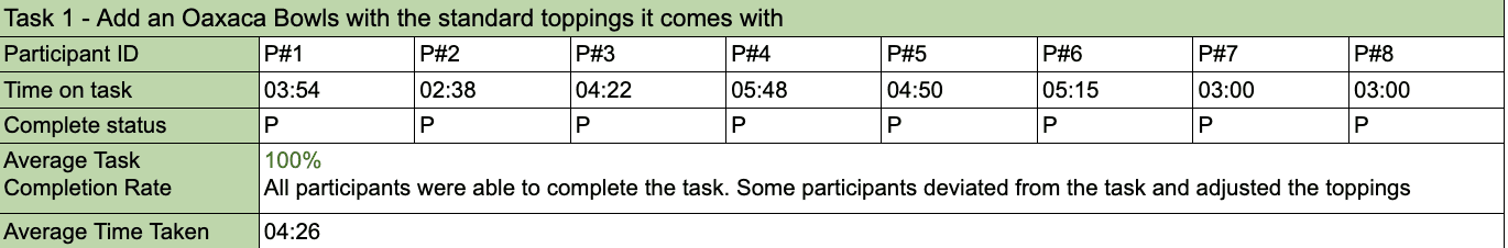
Task Scenario 1: Order an Oaxaca bowl
Objective: This task aims to assess the ease and clarity of the ordering process and identify any friction points users experience.
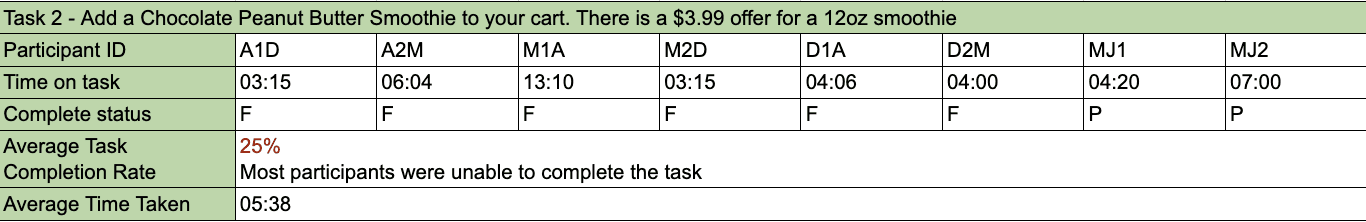
Task Scenario 2: Find and apply a promotional offer
Original prompt: Order a chocolate peanut butter smoothie. There's an offer for a 12 oz smoothie for $3.99.
Objective: The task aims to evaluate how users perceive or interact with promotional offers, assessing the discoverability and ease of redemption.
While this prompt was effective for testing a specific flow, I learned that more generalized prompts like "Order a customized bowl' can provide richer insights into how customers explore an app.
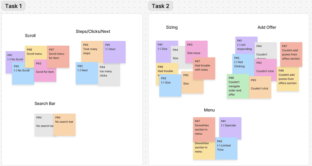
Affinity Mapping
Following our usability testing, we synthesized our findings to identify common themes and patterns through affinity mapping, allowing us to cluster observations and reveal core usability issues.
Usability Testing Metrics
Findings
The Disconnection Between User Expectation & The Interface
Our analysis of our usability testing revealed three core opportunities for improvement within Freshii's mobile application.
Issue#1: The item customization process
During the first task, a common friction point was the inability to scroll through the toppings selection. Most participants expressed frustration as they were forced to click "Next" for each category, violating the heuristics of flexibility and efficiency of use. This flow went against the participant's expectation
“I'm trying to scroll, but it’s not letting me” - P#2
Issue #2: Promotional offers are unclear and hard to redeem
The second task revealed significant usability issues relating to offer redemption. A common roadblock prevented participants from successfully applying the offer. The lack of clear instructions left participants feeling confused and frustrated.
“Do I need to do anything for the offer? I wish there was more information” - P#7
Issue #3: Item inconsistency
Participants who navigated to the item page, encountered issues with identifying the corresponding fluid ounce due to the inconsistency of sizing listed (snack, regular, large when ordering vs. 12oz smoothie on offer).
“How the hell am I supposed to know which one is 12oz brother?” - P#8
Recommendations
Based on our team's findings, we identified key recommendations to simplify and streamline the user experience. Although a full redesign was not required, I created mockups to illustrate how these recommendations would be implemented.
Improve the customization process:
Include a horizontal navigation bar to allow users to quickly navigate between different toppings, with the list of toppings offered, by adding a horizontal scroll, it informs the users which section the toppings are in, and allows users to quickly navigate to toppings they want to change
Removing the next button and replace it with add to cart to prioritize the action and reduce the number of clicks by increasing efficiency from browsing toppings to adding items to cart


Streamline offer redemption: clarify the offer details and improve consistency to prevent users frustration and drop offs.
Provide clear offer details showing how the offer is used, with clear instructions and call-to-action to apply it

Measuring Outcomes
To validate the impact of these recommendations, we would track and measure the following metrics after implementation:
Time on task: The average time it takes a user to complete the ordering process from customization to adding to cart.
Drop off rate: The percentage of users who abandon the app on the ordering screen
Offer redemption rate: percentage of users who successfully find and apply a promotional offer
Customer support tickets: Monitor the number of support request or inquires
Reflection & Key Takeaways
This usability testing project provided me with valuable insights into the UX research process and highlighted areas of improvements in my future approach.
One of the key take away from this project was the importance of crafting task scenarios. I discovered that our initial scenarios were too specific, which limited our ability to observe a wider range of our participant's behaviours. In the future, I will focus on developing tasks with clear objective that are still flexible enough to allow the users to explore the application naturally.
The second key takeaway from the project was the importance of effective note-taking and analysis. Often times, my team and I had to re-watch our recording to capture specific details which duplicated our work and effort. Moving forward, I will focus on taking more specific notes during my observations and analyzing findings as soon as possible, while the experience is still fresh.
Before this project, I wasn't sure whaat to expect from user research. It not only provided me with valuable skills but also changed my perspective. I now understand that user experience design is about more than just making pretty things. It's about understanding our users to allow us to craft seamless experiences that people don't notice, because it's only the bad experiences that stick out.